You are probably in the web designing industry for few years. So as a web designer or agency, you always try to make the impossible happen. You make an incredibly complicated process easy by doing it again and again. You always try to avoid common web design mistakes. When your work becomes beautiful and straightforward, you feel like a hero.

As a web designer, your primary goal is to create a great user experience (UX) and help to achieve user goals. For that, you use all kind of pattern and trends. Although as a digital designer, it is not always possible to use all of the trends and patterns. But sometimes you forget this. Then it becomes a disaster.
Sometimes you get diverted with things that look or seem cool. Before using any cool looking trend think if it can help your user or not. Regarding this Kate Rutter cleverly said, “ugly but useful trumps pretty but pointless.”
Please don’t get it wrong. I am not telling you to stop making a lovely design. I am suggesting you should make things beautiful and useful both. Try to find the balance between them.
Because when you make these mistakes, it can take you and your client both to the wrong direction. You know principles of design, communication, visual and color dynamics, color pallet, etc. But you don’t know people. You often don’t try to understand people.
And your lack of understanding creates a knowledge gap. This gap reflects on your work leading you to make some incredibly common but unpredicted web design mistakes mistakes.
I will go through some common UX mistakes designers do on a daily basis in this article so that you can avoid those.
Thinking User Knows All
You spend a lot of time using user interface. So it’s obvious that you know how things work on the web. But what about users? Nothing so much. That’s why making a hypothesis is wrong. You assume-
- User knows which question to ask.
- Understand the controls.
- Know what your icon, symbols or logos mean.
- Will follow the instruction you give.
- Know how to find what they want.
But in reality, this isn’t the scenario. Most of your kind have this pre-determination. And there lies the problem. Because-
- Some users can be clueless.
- Some can use your interface for the first time.
- Many can find your visual confusing.
- Some will not follow your instruction.
- While most of them don’t know what they are looking for.
Have you understood the problem? Your job is to direct and thin the hard surface. So, find out who is right for you and show other the door.

Make a Difference between User and Target Audience
Maybe everyone around you suggests making the design for the user. You are always told to focus on the needs of user and design according to them. Even above I said about the user.
But that is not quite right. Actually, it’s a poor idea.
You are asking yourself, why? Because you should focus on the target audience. I also meant to target audience above. You have to understand the difference between user and target audience.
For example, who want to make a site and who want to learn both are the user but as a web design agency only people who want to make sites are your target audience. So you should focus on them when you make a website.
Designing for Yourself
Sometimes it’s good to put some restraint on yourself. I am suggesting you this because at times creative and excellent ideas can lack you behind your competitors.
Too often, designers have a hard time editing down all the ideas they come up with. Instead, they force all those ideas in the design.
But to be a successful designer, you must take a step back now and then. You must isolate passion from ego. Try not to prove anything with design. Your only goal is to make a memorable experience for the user. This simple thing can establish you as a great designer. Don’t design for yourself rather design for the user.
- Put yourself on user’s shoe.
- Make user map to find out how different people engage.
- Work on customer persona.
- Pinpoint the challenging aspects of User Interface (UI).
- Conduct User survey, quiz, A/B testing if possible.

UX vs. UI
Remember User Experience (UX) and User Interface (UI) isn’t the same thing. But it is something that many designers get confused about.
- UI means the structure and looks of the experience. For better understanding, it’s how someone gets from Point A to B and what that all looks like.
- On the other hand, UX is concerned with how the user engages, feels and reacts to what’s in front of them.
These two are indeed related. The goal of UI design is to develop an efficient still appealing interface that helps to generate a good overall user experience. Though just because you have a great design doesn’t mean it will work well. UX requires mastery of different disciplines.
Annoying User with Pop-ups
While strategic use of pop-ups can increase conversion rate, it can also annoy the user. When users visit your website, you probably don’t want to make them angry. But if they hadn’t gone through the first sentence and the screen gets covered by a massive box asking their email address or something other than that is annoying.
You probably faced this kind of situation. If you don’t like to bombard by pop-ups the moment you visit a sit, your maximum users don’t like it either.
Consider having pop-ups during reader reaches middle or end of the article. Be humble, funny and sincere when you use pop-ups. Give an explicit exit button option. Most of the time users don’t find the exit button and get angry.
Don’t Focus on Background Image
Using a full image background is great web design trend. But giving it too much focus is suicidal. Many website designer and owner don’t understand the proper concept of the background image.
The main reason to use a background image is highlighting the content above the fold and drawing user attention. If any website doesn’t follow this concept, then that site apparently fails to use the effectiveness of background image.
A perfect website background image shouldn’t grab too much attention. Rather than, the main title and text should grab the attention.
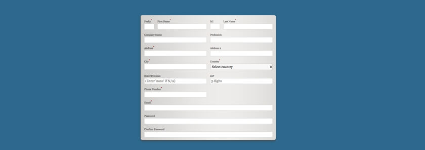
Excessive Form Fields
Another mistake that designer does is use too many form fields. Remember users are lazy. If you ask for more information, they will feel less motivated.
Whether you use it to sign up or to contact with clients, they don’t like to fill out long forms. So when you design a form, just add necessary fields. Eliminating unnecessary fields can prove you as a great designer.
Using Low Contrast
In recent years using low color contrast has become a trend in the web industry. But if it can’t be done properly that can cause difficulties. Using low contrast in a website can a make it harder for the visitor to read the content.
So you should not usually use low color contrast in the main body text. Your body contrast should be optimum so that user can read comfortably.
But if you do need to use low contrast, design with care. Choose the fonts wisely. If you use a thin font with low contrast, visitors won’t be able to read it. Don’t go over the top with low contrast design and keep usability in mind.
Lack of Whitespace
Another big mistake designer make is placing too many stuff on a single page. Having too many elements mean more elements competing to draw attention. The result is disarranged mess that only hurts the design.
Solution to this problem is keeping white & more breathing space highlighting important elements on that page. If you lack white space, then your potential consumer can miss the most valuable information. Using grid helps to organize information and space.

Having More Text
When you add too much text on your design, most people will not like it. Because 55% of user spends less than 15 seconds on a website, they scheme through the bullet points and bold text rather than a long bulk of texts.
People like visuals and engage much more with it. So try to use attention-grabbing images, videos, etc. when you design.
Following Same Old Process
Clients you came across through your career are not same. So don’t try to follow the same process with all of your customers. It is a major mistake that a lot of designers do. Try to be flexible when you are working with different clients.
Your clients are different and so their needs too. A person who wants a blog website won’t has any use of an e-commerce site. Target audience is different for both types. And this is true for your every individual consumer.
No single ‘flawless’ design process can be used again and again. You should look at the context of the project, the timelines and the expectations and design as needed. But that doesn’t mean you can’t have some key feature or activities that can take place on any project. Research before starting the project.
Conclusion
These are some common UX mistakes in the current web trends. I can understand that it is a lot to wrap your head around. So, it’s okay to make errors while you are working in the sector. Making a mistake is not a bad thing, many of us make mistakes too. So don’t feel guilty.
UX is one of those things that is continuously changing. Because it is integrated with new technologies and discoveries. This is the fun part cause if you remain up to date then you are ahead of many designers in the field.
I hope this article provided you some useful tips. As a designer or web agency, use your judgment and don’t afraid to improvise, but always keep the user in mind.
Have you improved following these techniques?

No Comments