User Interaction has an essential role in design. No matter what you design, your designs have to represent their intent and purpose. Since the invention of text, it has done a lot of heavy lifting in communicating mission. So you need to have a solid understanding of typography. Because fonts convey more than just word. This can say a lot about you and your business.
Typography is a huge sector. Designers devote years of their practice to this prehistoric art. Yet, there is always something new to learn. So picking the perfect font was never easy. Because your single choice can make the user love or hate your design.
Oliver Reichenstein said in his article; Web Design is 95% Typography.
Therefore, when it comes choosing the perfect typography, you have to consider lots of things including readability, load time, compatibility, brand tone, etc. That’s why in this article I will focus on the essential tips you should consider before selecting typography.
Size & Large x-Height
Font size can have a huge impact on the experience of the interaction of reading something online. Remember, the main point of your design is to help the user to achieve his goals.
Particularly, designers like to set their body copy at least 14px. However, often they chose a larger size like 16px. Alternatively, titles size depends on your need. It should be just big enough to draw the attention you want, not bigger than that.
Older users of people with visual disabilities struggle with small font size. For desktop, you can use 50-75 characters per line at 16px font. It’s a good rule for body text.
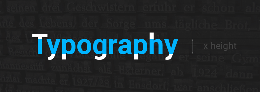
You should also use typography with large x-height. x-Height is the height of lowercase x. It measures the distance between the baseline or the imaginary line most letters sit on.
Why consider your font’s x-height? The reason is, larger x-heights tend to translate to more natural accuracy when setting at small sizes.
In user interface design, designers hardly have space for a lot of large-set text. So typesetting is all about discovering the balance between text size and simplicity. Fonts with large x-height will let you go smaller without becoming obscure.

Compatibility
Web browsers and technologies are always changing and getting updates. This makes web typography difficult. Select a typeface that is compatible with modern web interface used on both desktop and mobile.
Seems easy, right? But it’s not. Because it needs testing across multiple devices to find something that works accurately.

Use A Service
Speaking of compatibility, many designers use font services for compatibility purpose. This is a great idea and can help you to overcome most technical issues quickly. You can use Google Font API for this matter.
Apart from Google font, you have many other choices. Though Google Font is a free service, pricing tiers for the others vary from free option levels to more expensive kits. Some of these are-
These services have thousands of type option to choose and easy to use. The advantage of these services is they can provide a vast type library without having to spend money on individual fonts.

Combine Typography
This is not necessary; you can design an UI with one font. However, it’s beneficial to have a variety of fonts, weights, and styles on your hand. So you can combine fonts to accomplish that.
While some fonts pair naturally and look great together, others don’t look so good. Then again how can you choose the pair? The best way to select a font combination is just to put a lot of them side by side and find out the best ones. You can’t be sure until you tried them all.
Most of the times, the correct combination would be to sans-serifs. Other times you can use sans for headlines and serif for body copy. It doesn’t matter if they look similar or not. What matter most is if they act parallel or not. Besides, this also depends on the rest of your design.
For example, Libre Baskerville font doesn’t have the ™ character. So you can use “Times New Roman” in stack font and serif in the style rule. They will act similarly. Try it for yourself don’t just believe me.

Clear Letterforms
Letters can have ambiguity. So your font should have a lack of ambiguity. This means with smaller point sizes, and small pixel density, the individual shape of the letters of a typeface have to be clear and easily distinguishable from one another.
Erik Spiekermann said on difficulties of using Helvetica, “It really wasn’t designed for small sizes on screens. Words like milliliter can be tough to decipher. If you ever had to read or write a password with 1, i, l, or I, you know the problem.”
Here are the main culprits for letterform confusion-
- a, c, e, o (that’s A, C, E, and O)
- I, l, 1 (capital I, lowercase L, and the number 1)
- O, 0 (capital O and zero)
- r, n, m (lowercase R and lowercase N can become lowercase M)
Here is an example demonstrating the problem:
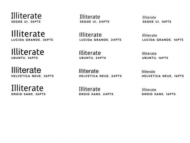 So choose typeface carefully from next time. See if these letters can be easily distinguished or not.

Load Time
When choosing a typeface, think about the load time. If it doesn’t load quickly, try another font. Because if not, it can slow your website. And users don’t have the patience for a slower site. They will bounce back, and you will lose money.
No matter how breathtaking the typeface, it needs to load near at lightning speed to be effective.
When selecting a font, test its speed. Then think about the other ways to load it faster. You can follow
- Use Limited Number of Fonts.
- Select only the style you want to use.
- Choose only The Languages you will use for a specific font.

Serif vs. Sans Serif
Serif or Sans? It is one of the fundamental questions and debate topics. Which one should you choose? Is there any difference at all? Or any advantage using a particular one?
Well, this controversy is decades old. There is some difference, but it is inconclusive. Serif fonts were a choice for newspapers, magazines, and other printable staffs. But sans are famous for technological aspect. Sans fit the screen better because of the lack additional elements.
User Test Inc. ran a test using serif and sans font. They found the average reading speed of sans font was 9% while the average reading speed of serif font was 10%. Which is statistically insignificant. They also found the serif group complained about the text as twice as the sans group.
Does that mean you should stop using serif fonts? Not at all. This means when you want to use a serif font, make sure you are choosing a clean and specific web font.

Think About Your Brand Purpose & Tone
Make sure your UI font aligns with your sites overall brand and purpose. It’s crucial. Every font has its personality and character. So be thoughtful when you pick one. While some fonts are elegant and refined, some are quirky and eccentric. Ask these questions to map it out:
- Is the project formal or casual?
- Should you use bold or lighter text?
- Are you selecting the font for large text or small?
- How will it act with color or image?
- Does the font mood match the words being read?
Explore hundreds of free fonts on the web, also try the premium ones too. Then decide which one best aligns with the tone and purpose of your brand.
EndNote
Great typography is critical for assembling a solid brand character and making an ideal early introduction. Yet, with such a large number of text styles out there, it can feel overpowering to pick the correct one. Don’t hesitate to try different things with various ones and refine as you go. Just don’t go overhead with the choices.
What are your favorite UI typefaces? Tell us in the comment section. We would love to hear.


No Comments