For last few year technological advancements and achievements have been at its peak. 2017 is a year full of technological accomplishments. Along with it, the world of web design is also evolving; no trend is constant in this industry.
Every year some new ux design trends come forward, some old trends fade out, and some trends evolve further. And, I am sure as a designer out there you are searching for new and innovative trends to try. Your goal is to beat the rush and stay on the top.
2017 was great for web design. Industry leaders have seen some astounding ux design trends for 2017. You will find details about these trends in this article. Let’s see what trends have stormed in 2017.
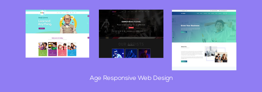
Age Responsive Web Design
Surroundings and elements of your life impact on how you use the internet. Your age has a significant effect on your behavioral. Think of a 7 years’ age kid and 70 years old person, both of the users has a different kind of taste and choice. While 7 years old kid is looking for fun video or games that will entertain him, the 70 years old person is looking for news or reading materials. So the choice and need are different.
All this year Responsive web design (RWD) has aimed to make the website seem it was tailor-made for a specific device. Maybe it’s a 4-inch Samsung, iPhone 7 Plus, or One Plus you will see the exact content like the creators intended to. But now RWD has taken age responsive design to its contrast. Now it will not only focus on how the site looks but also how it works, what type of content it displays, etc.
Each generation uses websites differently. So they have a different set of expectation in defining a site good or bad. Advertisers have been catering these expectations in the form of online targeted ads. Now it’s time to adopt this feature in web design. But it will serve user first and the marketer second.
You can make a completely different site for different age group of users who may visit your website. But when you are a small business owner you don’t have that much time or budget for all the different sites. So most smaller companies try to focus on programming for long shifts and changes in design to accommodate all these ranges of users.
In 2017, there was proliferation of metadata that adapted following changes-
- Larger font size and spacing for older users
- Color schemes will be different (monochrome for the old user and more vibrant color for younger ones)
- Simple navigation menus for older persons (it would change according to assumed user’s competency)
- Videos for younger users while text for older ones
Micro Mini Interaction
The concept of micro-interaction was the talk of the town back in 2015. This idea refers to product interaction based on singular tasks such as pressing the button or clicking like on Facebook. Individual interactions are cells that make up the total UX and micro-interactions are atoms within the cells. Then micro mini interactions are the particle of the molecule.
You are surrounded with micro-interactions, and you usually don’t notice them until something went terribly wrong. Micro-interactions are despite their small size and near invisibility, incredibly important. They are good for:
- Communicating feedback or the result
- Completing individual task
- Help the user to manipulate settings
- Preventing user errors
Apps and services are becoming detailed and gritty. So web industry leaders are expecting to move towards micro mini interaction.
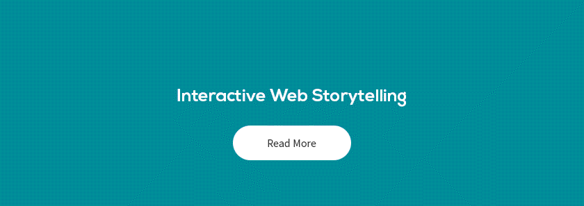
Interactive Web Storytelling
Sometimes stories can’t convey through images. In these cases, direct involvement of the user can be helpful. Interactive storytelling is the art of digital entertainment in which storyline is not predetermined. It’s the process of telling stories enriched with technological, social, or two-way interactive features to offer content adapted to new behaviors.
It can attract a lot of visitors to your website, and it’s one of the most effective approaches when done right.
Brands can use different ways to tell interactive stories. Already the use of videos to communicate brand messages to users have been abundant. There is more to come in 2017. Use of full-screen videos will increase in this coming year.
Research from CISCO indicates that by 2020, 79% of all consumer internet traffic will be video based. Already 63% of all mobile traffic is now already video based.
To achieve a more natural and interactional interface, web designers are currently using chatbots to create interaction between the user and the website on more personal level.
HTML5, CSS, and jQuery have allowed brands to include animation to their website. It’s used for interactive storytelling. Animated Call-to-Action buttons are coming to attract more visitors to the site.
But don’t go overboard. Instead, use a subtle movement in every few seconds to get attention. Without annoying your target audience.
Hapnotic Feedback
Hapnotic feedback technology refers to use of the touch sense in the user interface (UI). Such example is a virtual keyboard. Its individual keys provide tactile feedback when pressed. This technology has undergone a lot of advancement through the years. And it has become more sophisticated over the time.
With hapnotic feedback now users have a new way of handling website through haptic cues. Designers can incorporate hapnotic feedback. It is the use of subtle haptic clues in the form of subtle hypnosis. Now designers can use a sequence of indirect pluses and vibration to lead a user to a ‘click now’ button. They can even discourage the user from leaving the page activating pleasant texture on the page.
Though it is in the experimental phase, this feature will be available in the industry in next few months.

Mobile First Design
Mobile first approach is designing for mobile screen, or smaller screened device first, then building up bigger ones. Prioritizing mobile-first design isn’t new and has been around for few years.
The mobile device has officially named as the primary device for browsing websites. That’s why more companies realized of having mobile-friendly sites. This technique efficiently delivers content.
As a designer, you should design content to fit on mobile and smaller screened devices first. Then work towards the larger screened devices.
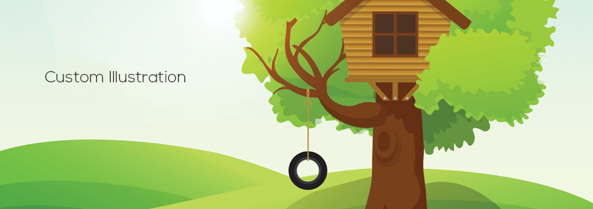
Custom Illustration
You can find lots of websites that look and work alike. That’s why many designers are moving away from using stock images, videos, and icons on their site. Instead, they are making custom illustrations and original assets.
Nowadays web designers don’t use flashy typography. Somewhat web typography has become common in the web industry. Most brands will use the advantage of over-sized and hand-drawn typography. It will help to create more powerful and straightforward brand tone.
Today customers and users seek authenticity. So stock images of creatives sat around a screen won’t cut anymore. Instead, designers have to use personalized illustrations of playful and friendly element. Creative designers will create illustrations which are full of quality to match the brand tone.
Instead of stock images, authentic photography will remain to be an essential in web design. Brands will curate high-quality images to attract users and help them emphasizes their brand.
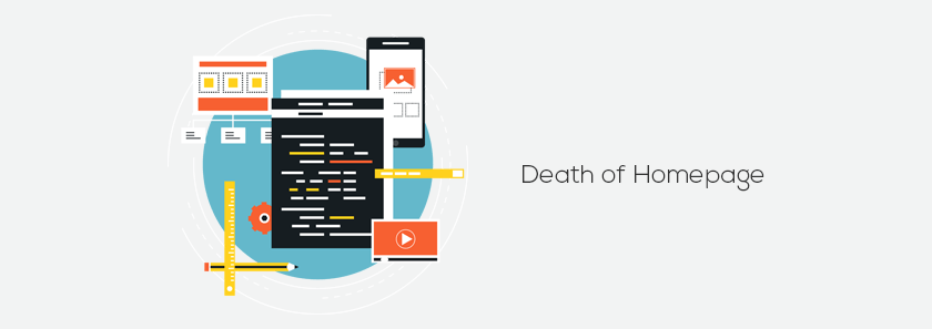
Death of Homepage
As the title seems, it doesn’t mean precisely that at all. We don’t expect the complete rejection of homepage. That would be crazy.
But this year, we have seen the devolution of homepages and rise in landing page design. The landing pages will work based on customers behavioral and demographic information. This means variants of your homepage will target different demographic with what’s important to them.
Every website needs a homepage. But as the content marketing spreads, website owners will want direct traffic to dedicated landing pages to better target their users and needs. It can help to boost conversion rate and awareness.
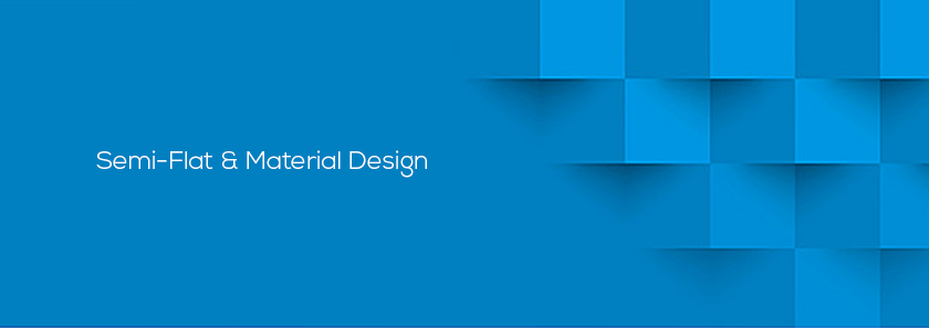
Semi-Flat & Material Design
Flat design has been around since the launch of windows metro style. But it has reached the point where everything is starting to look the same. Websites have lost their personality and creativity in design.
Now designers are shifting from flat design to semi-flat design. They are using subtle shadow and transitions for this issue.
Another more abundant alternative to flat design is Material design. It uses shadow effect and the concept of movement and depth to make the design that is more appealing to the user. The goal of this design is to create a clean and modernistic design that focus on user experience. Material design has a lot common with its alternative flat design.
Conclusion
There are lots of trends going on in any creative industry at one time. Covering every single one in a single article is hard. But above you will find some of the core ones to be focusing on in 2017.
Great designers always find new and innovative design ideas to evolve with the web design industry. If you follow this trends, we can assure you that you will be ahead in your competition.

No Comments